oct 2025 | FIRSTCLUB
Designing for category discoverability
FirstClub built its brand on a simple principle: quality over speed.
I designed and shipped the Thumbnail Selector and the Product Highlight as widgets that educated users about what made each category worth their attention, embedding FirstClub's curation philosophy into the interface itself.
57.7%
conversion
of unique clickers → ATC
40+
l2/l3 categories
covered in 30 days
4.4x
Growth
in daily impressions
The problem
New L2 and L3 categories were invisible even after a few days of launch. Each carrying the same level of curation and quality as everything else on the platform.
The homepage handled discovery at the top level well, what was missing was a path from a top level categories (L0 and L1) into the specific (L2 and L3) a user actually wanted, where majority of the discovery was turning into add-to-cart.
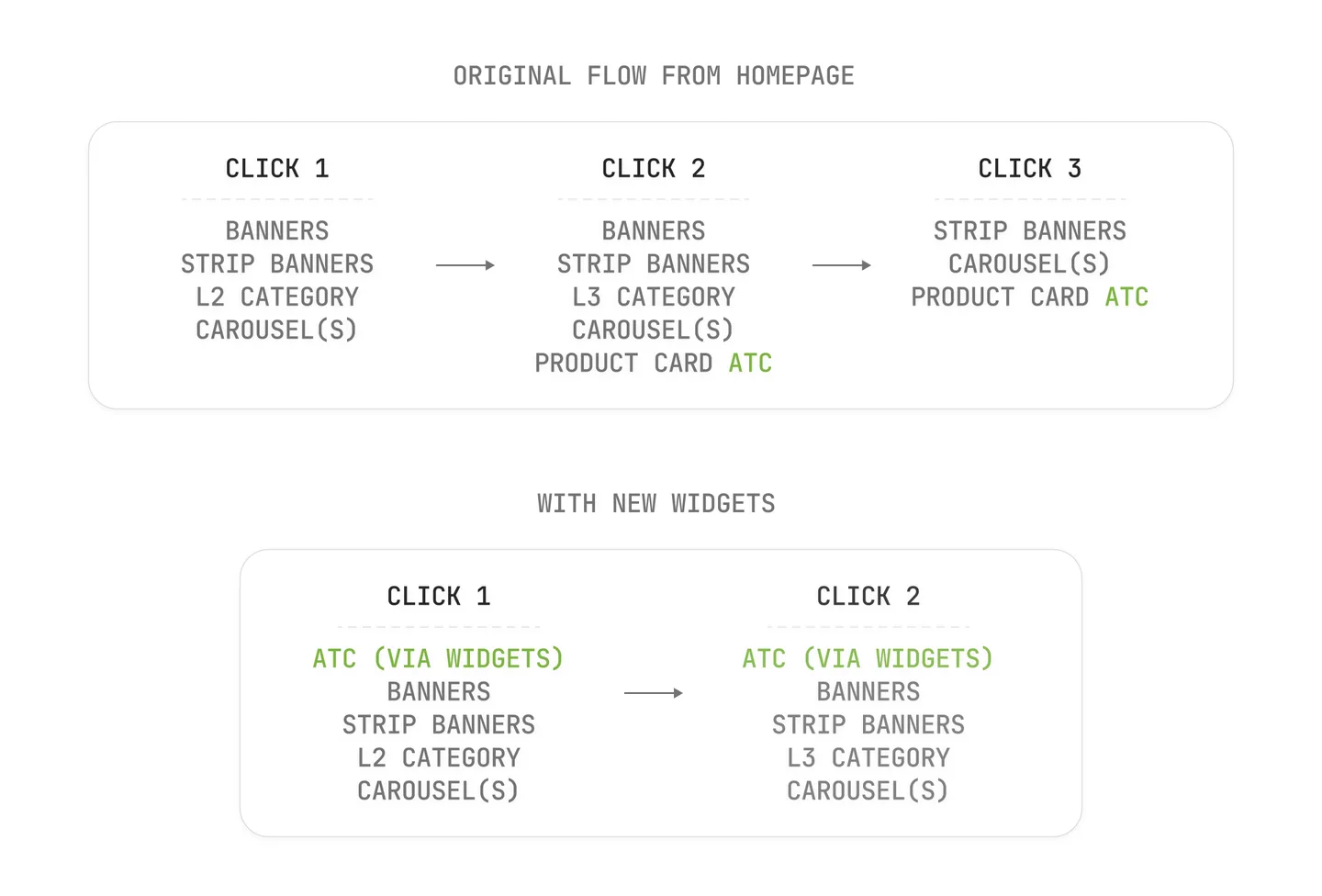
Users couldn't discover these carefully vetted products without already knowing to look for them. Curation without visibility is just inventory no one sees.
The thumbnail selector
The pattern itself isn't new, most quick-commerce apps run some version of it : a horizontal rail of category tiles, tap one, land inside. The pattern works because it's fast and familiar.
The part that needed real design thinking was making it work for FirstClub's specific problem, not just reusing the pattern by default. The key decision was that the first card in the rail isn't a category tile but is media rich.
Every other card in the rail is a direct route into an L2/L3 category, no intermediate screen, no filter step. The user sees the full set of what's available and picks, rather than searching for it.
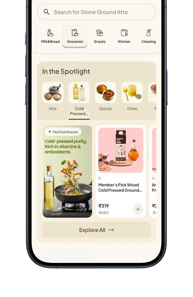
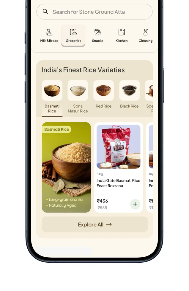
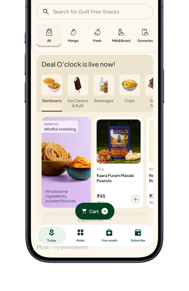
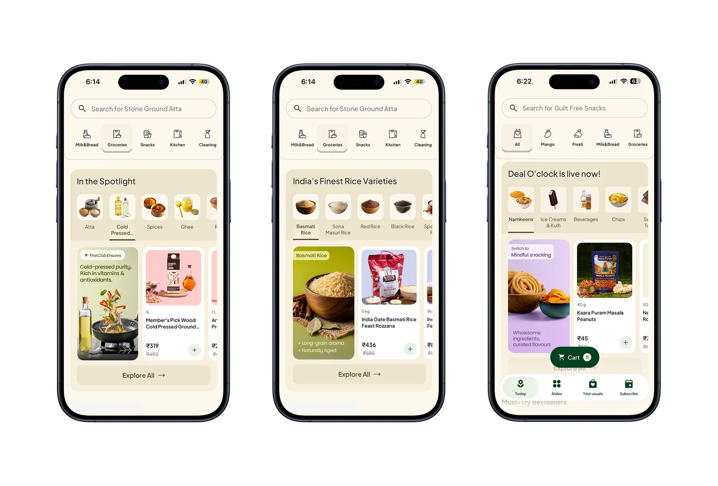
The “Deal O’ clock” instance reached 4.4x growth in daily impressions in under 5 months (6,968 to 30,704/day) and generated ₹14L in GMV in the first 17 days live, while the system expanded from 12 to 40+ live categories.
The product highlight
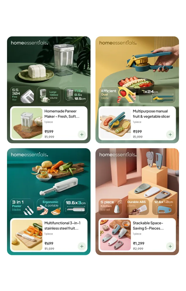
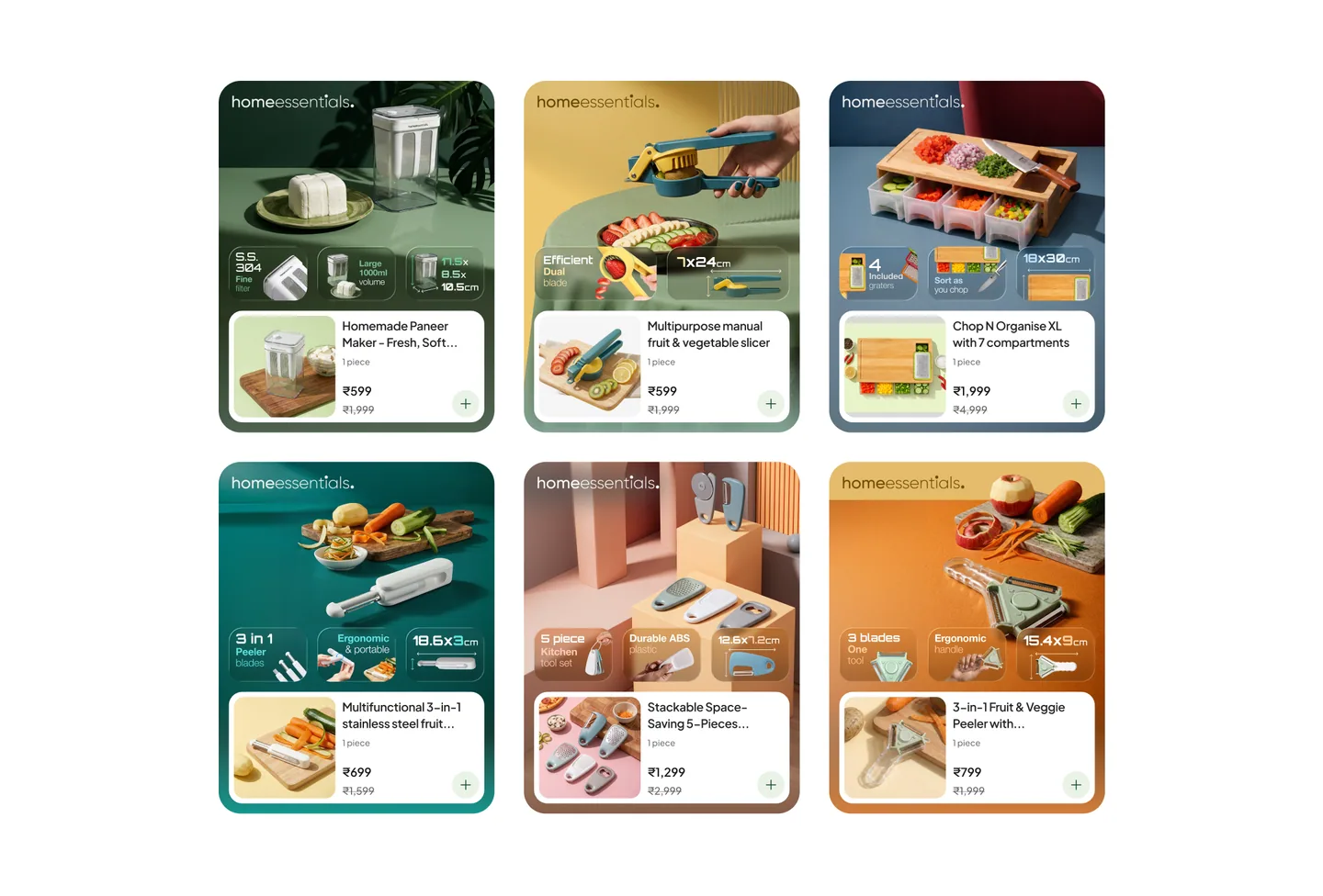
Following the “media rich” philosophy, the product highlight widget demanded a horizontal adaptation of the product card while retaining the same hierarchy but not competing with the visual in the first place.
It’s strength showed up in reach, not efficiency. The New User store instance reached 191,843 impressions, the largest reach of anything measured but converted at just 0.43% CTR. It found it’s place doing an awareness job uplifting the trust for users who aren't ready to transact yet.
It also found it’s place where communication of information dense category promises and essential functionality of the product were paramount
Findings & next steps
Across the two widgets and multiple of it’s instances, the basket value spread ranged from ₹382 to ₹1,327 depending on category, a 3.5x spread that shows which categories drive volume versus which drive higher-value baskets.
The widgets also worked as a diagnostic tool. Grouping categories by function this way surfaced patterns we couldn't see before, and that qualitative read shaped how we treated categories visually going forward, with more focus on what actually drives add-to-carts rather than just impressions.
What I would do differently
On the Thumbnail Selector, I'd experiment with a fixed category rail, a version built for theme-heavy pages with real monetisation potential.
On the Product Highlight, I'd explore a "category highlight" variant that could surface multiple products of equal quality at once, instead of spotlighting just one.
But once the Selector's rail becomes fixed and the Highlight starts carrying more than one product, the line between the two widgets starts to blur. Each currently has a distinct job, and losing that clarity would be a real cost. Still, it's a trade-off worth testing.
None of this happened in isolation. This project moved because of the people who built alongside me, questioned my decisions, and pushed the work further than I would have gotten on my own. Thank you to Munz, Gouri Vats, Abhishek Verma, Kareen George, Rahindh Rosh, Prakhar Vyas, Shardul Tamane, Rushil Ahuja, Ankita Jha, Kulsum Zaheer, and Arvind Charanyan for the collaboration, the feedback, and the trust.